The Latest on Geographic Variation in Medicare Spending: A Demographic Divide Persists But Variation Has Narrowed
Findings
How does Medicare per capita spending vary by county in 2013, and what are the characteristics of the counties with the highest and lowest Medicare per capita spending?
Unadjusted Medicare per capita spending in 2013 averaged $9,415 nationwide, but was nearly two times greater, on average, in the 20 counties with the highest per capita spending ($13,149) than in the 20 counties with the lowest per capita spending ($6,726) (Figure 1). Unadjusted Medicare per capita spending in 2013 ranged from a low of around $6,000 in Josephine County, Oregon to a high of more than $16,000 in Miami-Dade County, Florida (Appendix 2: Table 1).
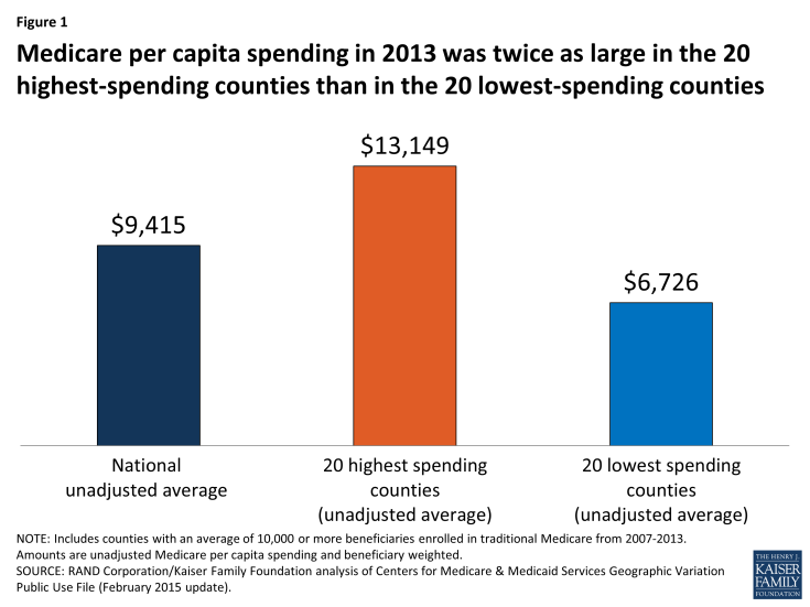
Figure 1: Medicare per capita spending in 2013 was twice as large in the 20 highest-spending counties than in the 20 lowest-spending counties
Most (13 of 20) of the counties with the highest unadjusted Medicare per capita spending in 2013 are in states in the northeastern and mid-Atlantic regions of the country (NY, MD, NJ, PA, CT, MA), five are in Southern states (FL, TX, LA), and the remaining two are in California and Michigan (Figure 2).1 In contrast, most (14 of 20) of the counties with the lowest per capita spending are in western states (OR, CO, NM, HI, MT, WA). The 20 highest-spending counties included substantially larger numbers of Medicare beneficiaries than the 20 lowest-spending counties (totaling 4.6 million versus 735,000 in 2013).
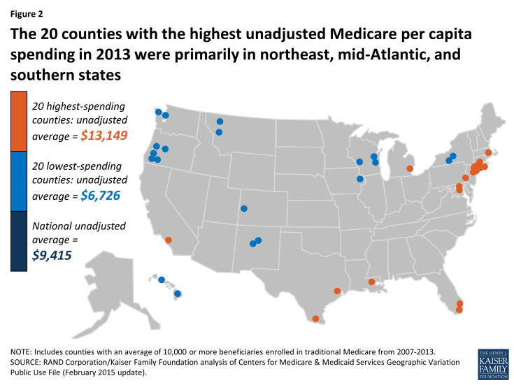
Figure 2: The 20 counties with the highest unadjusted Medicare per capita spending in 2013 were primarily in northeast, mid-Atlantic, and southern states
The highest-spending counties differ from the lowest-spending counties on several dimensions, including beneficiary health status, income, race and ethnicity, and measures of provider supply (Figure 3; Appendix 2: Table 2). For example, 42.5 percent of beneficiaries in the highest-spending counties have five or more chronic conditions, almost double the rate among beneficiaries in the lowest-spending counties (23.4%), and higher than the national average (34.0%). The average poverty rate among people ages 65 and older is nearly two times greater in the 20 highest-spending counties (14.7%) than in the 20 lowest-spending counties (7.8%), and higher than the national average (9.8%). Relatively high poverty rates in the highest-spending counties are reflected in the larger share of beneficiaries dually eligible for Medicare and Medicaid: 34.9 percent in the 20 counties with the highest Medicare per capita spending compared to 16.5 percent in the 20 counties with the lowest per capita spending. A much larger share of beneficiaries in the highest-spending counties are black (19.1%) than in the lowest-spending counties (1.0%) or nationally (9.8%). Similarly, Hispanic beneficiaries account for 17.8% percent of beneficiaries in the highest-spending counties, but just 7.1 percent of beneficiaries in the lowest-spending counties and 6.0 percent nationally.
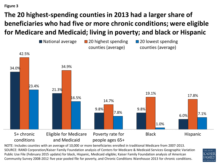
Figure 3: The 20 highest-spending counties in 2013 had a larger share of beneficiaries who had five or more chronic conditions; were eligible for Medicare and Medicaid; living in poverty; and black or Hispanic
Counties with higher unadjusted Medicare per capita spending in 2013 typically had a larger supply of various types of providers than the lowest-spending counties (Appendix 2: Table 2). Notably, the 20 highest-spending counties had 33.7 doctors per 10,000 county residents in 2012 (the most recent year available), 9.7 more than the national average and 9.3 more than in the lowest-spending counties. The highest-spending counties also had more hospital beds and home health agencies per 10,000 county residents compared to both the national average and the lowest-spending counties, but a smaller number of hospices and ambulatory surgical centers.
The 20 highest- and lowest-spending counties differed substantially in spending per capita for specific Medicare-covered services in 2013 (Figure 4; Appendix 2: Table 3). By far the most important service category in terms of explaining spending differences between the highest- and lowest-spending counties is hospital inpatient care—which is perhaps not surprising, given that inpatient spending is among the most costly types of Medicare-covered service both on a per-capita and a per-user basis. Average spending per capita on hospital inpatient care in 2013 was more than twice as high in the highest-spending counties than in the lowest-spending counties ($4,914 versus $2,335). The difference in hospital inpatient spending is due to a combination of a larger share of the beneficiary population using hospital inpatient services, higher prices paid, and greater quantity and intensity of services received by inpatient users in the 20 highest-spending counties. For example, in the highest-spending counties, an average of 19.2 percent of traditional Medicare beneficiaries had a hospital inpatient stay, compared to the national average of 17.5 percent and 13.2 percent in the 20 lowest-spending counties. Hospital inpatient use was also higher in the 20 highest-spending counties, averaging 2,081 days per 1,000 beneficiaries, compared to 1,530 nationally and 988 in the 20 lowest-spending counties.
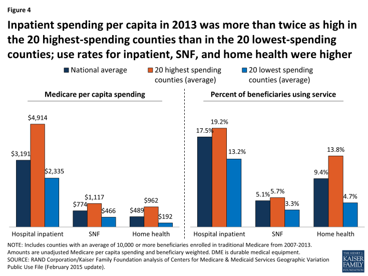
Figure 4: Inpatient spending per capita in 2013 was more than twice as high in the 20 highest-spending counties than in the 20 lowest-spending counties; use rates for inpatient, SNF, and home health were higher
The 20 highest-spending counties in 2013 also had substantially higher spending and use for post-acute care (skilled nursing facility (SNF) and home health care services) relative to the national average and the 20 lowest-spending counties. SNF spending per capita in 2013 averaged $1,117 in the 20 highest-spending counties, 44 percent higher than the national average ($774) and 140 percent higher than in the 20 lowest-spending counties ($466). The per capita spending differences were even larger for home health services ($962, $489, and $192, respectively). The percent of traditional Medicare beneficiaries using SNF in the 20 highest-spending counties in 2013 (5.7%) was higher than national average (5.1%) and higher than in the lowest-spending counties (3.3%). The differences in use rates for home health are even more striking: 13.8 percent of beneficiaries used home health services in the 20 highest-spending counties in 2013, compared to a national average of 9.4 percent, and just 4.7 percent in the 20 lowest-spending counties. The number of SNF covered days per 1,000 beneficiaries was significantly higher in the 20 highest-spending counties (2,429) than the national average (1,887) or the average for 20 lowest-spending counties (1,093). Home health visits per 1,000 beneficiaries averaged 6,207 in the highest-spending counties—six times more than in the lowest-spending counties (1,019) and twice the national average (3,062).
Taken together, these findings suggest that higher unadjusted county-level Medicare per capita spending is partly driven by having a traditional Medicare beneficiary population that is poorer and sicker than average and that uses hospital inpatient services and post-acute care at higher rates and with greater intensity than beneficiaries in lower-spending counties. Counties with relatively high Medicare per capita spending also have a larger supply of certain health care providers than lower-spending counties, which may be related to having a sicker beneficiary population.
How does the amount of variation, and the characteristics of high- versus low-spending counties, differ if rankings are based on unadjusted Medicare spending versus Medicare spending adjusted for differences in prices and beneficiary health status?
Ranking counties based on their actual (unadjusted) Medicare per capita spending reveals the counties where Medicare spends the most and the least, but these spending amounts reflect both the prices that Medicare pays for services at the local level and the health status of beneficiaries living in each county. When we adjust for these price and health-risk differentials and compare the average adjusted per capita spending amounts between the 20 highest-spending counties and the 20 lowest-spending counties, we find that the gap between the averages narrows substantially—from a 96 percent difference ($13,139 versus $6,726) to a 22 percent difference ($9,344 versus $7,640)—but does not disappear (Figure 5). This reduction in the gap between the average spending amounts based on adjusted per capita spending makes sense, since the adjustment mitigates two of the factors (price and health risk) that contribute to county-level spending variation.
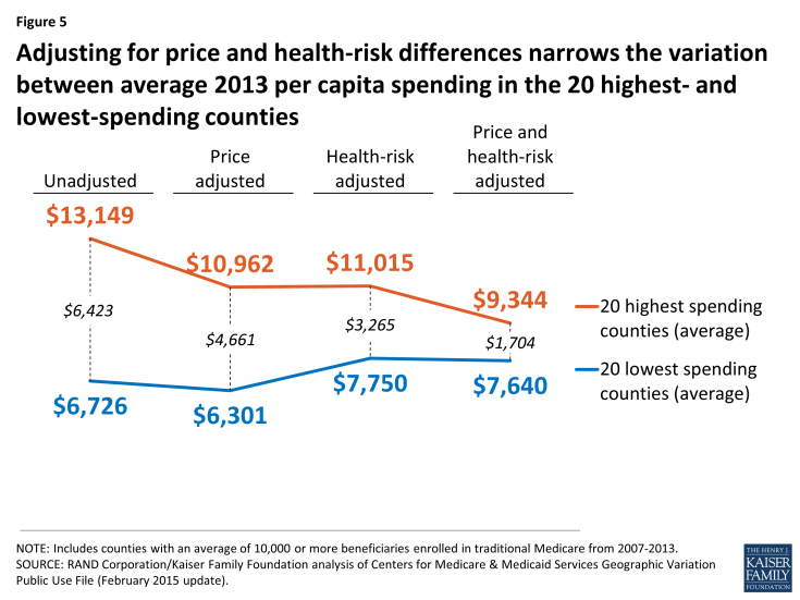
Figure 5: Adjusting for price and health-risk differences narrows the variation between average 2013 per capita spending in the 20 highest- and lowest-spending counties
Another way of exploring the effect of price and health-risk adjustments is to examine the ranking of counties based on adjusted Medicare per capita spending, which produces a different set of counties at the top and bottom of the rankings than ranking based on unadjusted per capita spending. Based on this ranking, 19 of the 20 counties with the highest adjusted Medicare per capita spending are located in southern states (TX, LA, FL, OK, AL), with 9 counties located in Texas alone, and only one county located in a non-southern state (OH) (Figure 6; Appendix 2: Table 4). In contrast, a majority (17 out of 20) of the lowest spending counties based on price and risk-adjusted per capita spending are located in western states (CA, CO, HI, NM, OR), including 9 counties in California alone; the remaining 3 counties are in AK and NY.
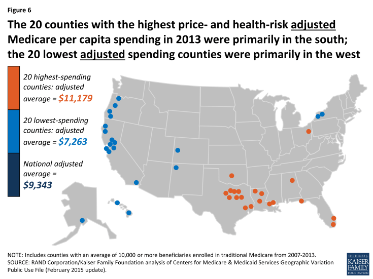
Figure 6: The 20 counties with the highest price- and health-risk adjusted Medicare per capita spending in 2013 were primarily in the south; the 20 lowest adjusted spending counties were primarily in the west
Based on the county rankings by price and health-risk adjusted spending, we find that some demographic differences between the 20 counties at the top and bottom of the ranking, but those differences are not as large as the differences between the counties ranked by unadjusted per capita spending. The 20 highest adjusted spending counties have a somewhat sicker beneficiary population (HCC score of 1.11 versus 0.96), and a larger share of black (8.9% versus 6.8%) and Hispanic (15.8% versus 10.6%) beneficiaries, but a smaller share of beneficiaries eligible for both Medicare and Medicaid (25.3% versus 28.9%) (Appendix 2: Table 5).
In terms of provider supply, the 20 counties with the highest adjusted per capita Medicare spending had 26.5 percent fewer physicians per 10,000 residents than the 20 counties with the lowest adjusted spending, but a larger supply of hospital beds and ambulatory surgical centers, as well as more post-acute providers, including SNF beds, home health agencies, and hospices. Higher adjusted Medicare per capita spending in the top 20 adjusted spending counties could reflect what the Dartmouth researchers refer to as “practice patterns” related to having a larger supply of certain types of providers, or it could reflect higher levels of demand related to having somewhat sicker beneficiary populations.
How much variation exists across counties in the rate of growth in Medicare per capita spending between 2007 and 2013, and what are the characteristics of the counties with the highest and lowest per capita spending growth rates?
The annual rate of growth in Medicare per capita spending between 2007 and 2013 averaged 2.2 percent nationally, and ranged from -0.9 percent, on average, among the 20 counties with the lowest spending growth rate (i.e., a decline in nominal per capita spending) to 4.6 percent, on average, among the 20 counties with the highest spending growth rate (Figure 7).
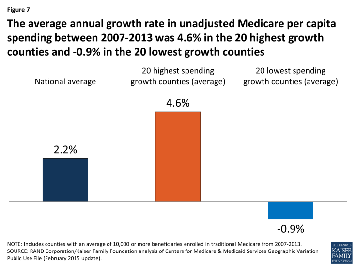
Figure 7: The average annual growth rate in unadjusted Medicare per capita spending between 2007-2013 was 4.6% in the 20 highest growth counties and -0.9% in the 20 lowest growth counties
Between 2007 and 2013, five counties experienced negative average annual growth in per capita spending: Miami-Dade County, FL (-1.84%), Hidalgo County, TX (-1.70%); Wilson County, TN (-0.35%), Orange County, NC (-0.17%), and Walker County, AL (-0.08%). Fifteen of the 20 counties with the lowest spending growth rates are in southern states, while the 20 counties with the highest spending growth rates are more geographically dispersed (Figure 8; Appendix 2: Table 6). None of the 20 counties with the highest spending growth rates between 2007 and 2013 were among the 20 counties with the highest per capita spending amounts in 2013; similarly, none of the 20 counties with the lowest spending growth rates between 2007 and 2013 were among the 20 counties with the lowest per capita spending amounts in 2013.
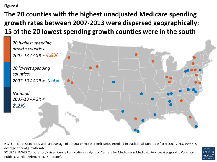
Figure 8: The 20 counties with the highest unadjusted Medicare spending growth rates between 2007-2013 were dispersed geographically; 15 of the 20 lowest spending growth counties were in the south
Unlike the 20 highest-spending and lowest-spending counties, where a comparison reveals several differences in beneficiary characteristics in 2013, there are few notable differences in health status or demographics between the counties with the highest spending growth rates and lowest spending growth rates (Appendix 2: Table 7). The 20 counties with the highest spending growth rates had somewhat fewer Medicare beneficiaries in 2013 than counties with the lowest spending growth rates (totaling 658,000 versus 994,000), but these two sets of counties were similar in terms of average HCC scores, the share of black beneficiaries, and the share of beneficiaries who were eligible for both Medicare and Medicaid in 2013. The only demographic characteristic that differed between counties with the highest and lowest spending growth rates was that Hispanic beneficiaries represented a much larger share of beneficiaries in the lowest spending growth counties, on average, in 2013 (32.4% versus 4.4%); this is likely due to the fact that Miami-Dade County and a handful of counties in Texas with much higher-than-average shares of Hispanic beneficiaries were among the 20 counties with the lowest Medicare per capita spending growth rates across these years.
We also did not observe major changes in beneficiary demographics between 2007 and 2013 that would suggest that such changes played a large role in the rate of Medicare per capita spending growth in these counties. We did observe a difference in the average annual rate of growth in the overall poverty rate among county residents of all ages, which increased at an average annual rate of 4.4 percent in the 20 counties with the highest spending growth rates, compared to 2.3 percent in the 20 counties with the lowest spending growth rates. Average annual growth in the share of black, Hispanic, and Medicare-Medicaid eligible beneficiaries was slightly higher in the highest spending growth counties than in the lowest spending growth counties, while Medicare Advantage penetration increased at the same average annual rate in both sets of counties.
We examined changes in the rate of growth in measures of provider supply to assess whether counties with higher rates of Medicare per capita spending growth also had faster growth in provider supply compared to counties with lower spending growth rates (Appendix 2: Table 7). Contrary to expectations, we found no discernable relationship. For example, in the 20 counties with the fastest growth in Medicare per capita spending, the average number of physicians per 10,000 county residents grew slightly at an average annual growth rate of 0.4% (from 21.0 in 2007 to 21.5 in 2012, the latest year available), and was unchanged in the 20 slowest-growing counties (27.4 in both 2007 and 2012). For another example, we observed a decline over time in the number of hospital beds and skilled nursing facility beds per 10,000 county residents in both the 20 counties with the highest spending growth rates and the 20 counties with the lowest spending growth rates.
Although we did not observe major distinctions between high-spending growth and low-spending growth counties in terms of changes in beneficiary demographics and provider supply measures, we did observe notable differences between these groups of counties in the rate of change in service spending and use between 2007 and 2013. Three service categories account for much of the difference in spending growth between the counties with the highest and lowest spending growth rates: hospital inpatient, home health, and durable medical equipment (DME) (Figure 9; Appendix 2: Table 8).
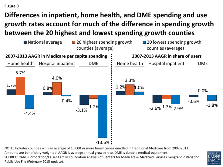
Figure 9: Differences in inpatient, home health, and DME spending and use growth rates account for much of the difference in spending growth between the 20 highest and lowest spending growth counties
In the 20 highest spending growth counties, average hospital spending per capita increased by 4.0 percent between 2007 and 2013, while it decreased by 0.4 percent in the 20 lowest spending growth counties. Readmission rates increased by 0.2 percent, on average, in the highest spending growth counties, but decreased by 0.8 percent in lowest spending growth counties. The difference in growth in spending on home health services was even more striking: increasing at an average annual rate of 5.7 percent in the highest spending growth counties, but decreasing at an average annual rate of 4.4 percent in the lowest spending growth counties. DME spending per capita fell in both the highest and lowest spending growth counties, but the average annual decrease was much smaller in the former set of counties than the latter (-1.2% versus -13.6%).
Compared to the 20 lowest spending growth counties, the 20 counties with the highest spending growth experienced higher average annual growth in the share of beneficiaries using home health services (3.3% versus 1.0%), and a smaller average annual decrease in the share of beneficiaries using hospital inpatient services (-1.3% versus -2.9%). Conversely, the 20 lowest spending growth counties experienced a reduction in the rate of growth in users of DME services, compared to a flat rate of growth in the highest spending growth counties (-1.8% versus 0.0%).
Did the amount of geographic variation in Medicare per capita spending increase or decrease from 2007 to 2013?
Our analysis shows that, in general, counties with relatively high Medicare per capita spending in 2007 tended to experience relatively low spending growth between 2007 and 2013, and vice versa (Figure 10). But although county-level 2007 Medicare per capita spending is negatively related to spending growth over time, high levels of Medicare per capita spending by county have tended to persist over time. Of the 20 counties with the highest per capita spending in 2013, all but two were among the 20 highest-spending counties in 2007 (Appendix 2: Table 9).
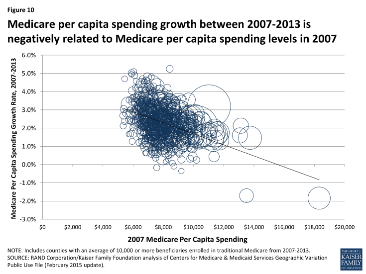
Figure 10: Medicare per capita spending growth between 2007-2013 is negatively related to Medicare per capita spending levels in 2007
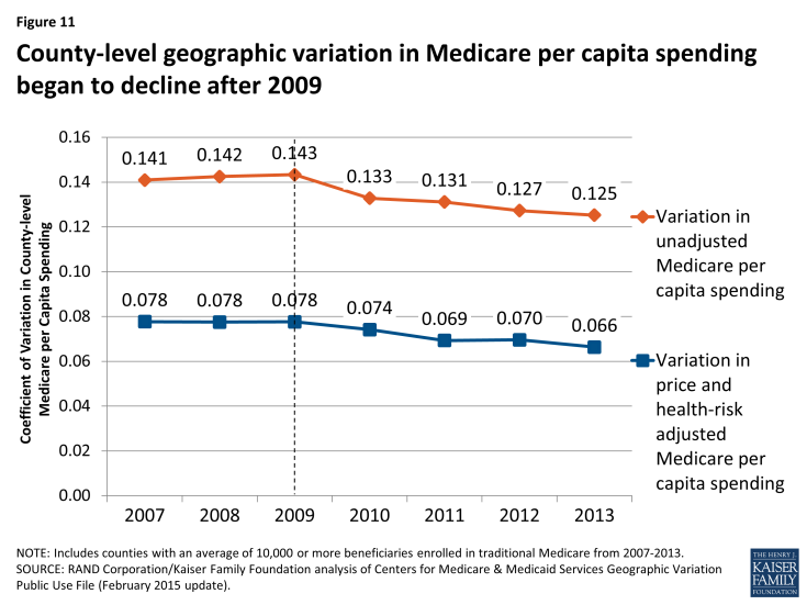
To further explore the question of whether geographic variation narrowed or widened over these years, we measured the beneficiary-weighted county-level coefficient of variation for each year from 2007 through 2013 for two spending measures: unadjusted per capita spending, and price and health-risk adjusted per capita spending, including all counties (not just counties with 10,000 or more beneficiaries). We found that the coefficient of variation for unadjusted per capita spending increased slightly from 2007 (0.141) to 2009 (0.143), and then decreased each year thereafter, falling to 0.125 in 2013, a 13 percent decline (Figure 11; Appendix 2: Table 10). The coefficient of variation in adjusted per capita spending followed a similar trend, rising initially and then falling by 15 percent from 2009 to 2013 (from 0.078 to 0.066). We also examined the coefficient of variation by type of service, and found that declines in geographic variation were particularly pronounced for three service categories: home health, durable medical equipment, and hospice. This convergence, or narrowing of variation, in county-level Medicare per capita spending in recent years represents the continuation of a trend since the 1970s toward a reduction in geographic variation in Medicare per capita spending.2

