Visualizing Health Policy: Health Coverage Under the Affordable Care Act (ACA)
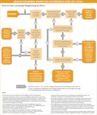
The December 2012 Visualizing Health Policy infographic is a flowchart illustrating the mechanisms by which people will get health coverage beginning in 2014.
 See the full-size infographic at The Journal of the American Medical Association.
Visualizing Health Policy is a monthly infographic series produced in partnership with the Journal of the American Medical Association (JAMA). Each month’s infographic is freely available on JAMA’s website and is published in the print edition of the journal.
