The independent source for health policy research, polling, and news.
Visualizing Health Policy: The 2014 Ebola Outbreak
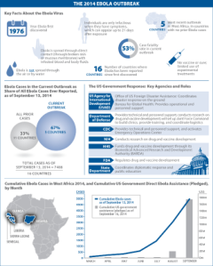
This Visualizing Health Policy infographic provides a snapshot of the 2014 Ebola outbreak in West Africa. It includes key facts about the Ebola virus, shows how the number of Ebola cases in the current outbreak outstrips the case total from all previous Ebola outbreaks, and offers a summary of the key U.S. agencies responding to the crisis and the roles they are playing. In addition, it provides a look at the growing 2014 Ebola case count in West Africa compared to U.S. government funding commitments.
Visualizing Health Policy is a monthly infographic series produced in partnership with the Journal of the American Medical Association (JAMA). The full-size infographic is freely available on JAMA’s website and is published in the print edition of the journal.
