Visualizing Health Policy: Health Care Costs
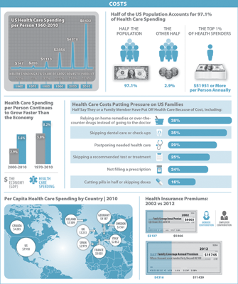
The September 2012 Visualizing Health Policy infographic examines health costs in the United States, including how costs have changed, how they compare to some other countries, and how they impact American families.
See the full-size infographic at The Journal of the American Medical Association
Visualizing Health Policy is a monthly infographic series produced in partnership with the Journal of the American Medical Association (JAMA). Each month’s infographic is freely available on JAMA’s website and is published in the print edition of the journal.

