Medicare Advantage Hospital Networks: How Much Do They Vary?
Results
Breadth of Hospital Networks
Counties included in this study differed in size and the number of hospitals, ranging from a high of 106 in Los Angeles County to a low of 8 in Multnomah County (Table A1). All of the Medicare Advantage plans in this study engaged in some selectivity in hospitals included in their network, but the share of hospitals included varied across plans, counties, and types of Medicare Advantage plans.
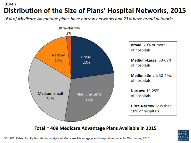
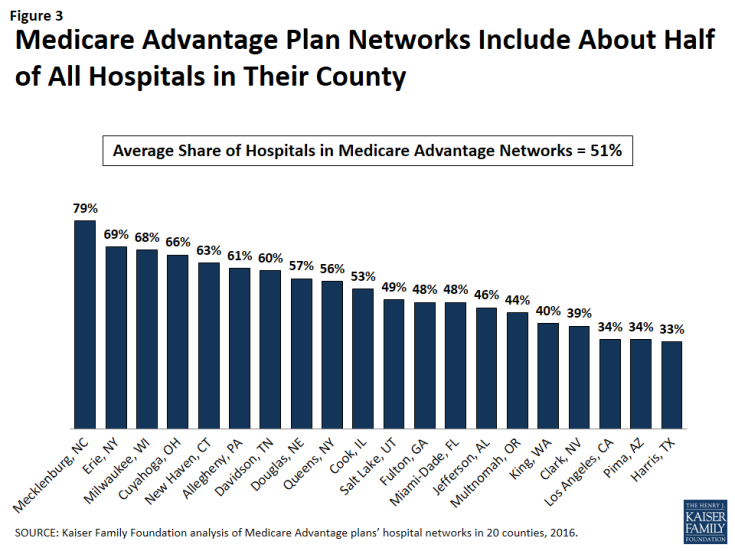
On average, plans included about half (51%) of the hospitals in the county in their network in 2015. About one-quarter (23%) of Medicare Advantage plans were classified in our analysis as having broad networks, meaning that they included at least 70 percent of the hospitals in the county (Figure 2). Most plans (61%) had medium sized networks, with between 30 and 69 percent of hospitals in the county. About one in six Medicare Advantage plans (16%) had narrow hospital networks, meaning that they included less than 30 percent of all hospitals in the county. This includes 8 plans (2%) that had less than 10 percent of the hospitals in the county within their network. Three of these 8 plans (in Multnomah and Fulton counties) did not include any hospitals within county borders but included hospitals in neighboring counties.1
By County
The share of a county’s hospitals included in plans’ networks, on average, ranged from 33 percent in Harris County to 79 percent in Mecklenburg County (Figure 3 and Table A2). These hospitals accounted for 61 percent of all hospital beds in the county, ranging from 38 percent in Los Angeles County to 94 percent in Mecklenburg. Measuring the breadth of the plan networks by the share of hospitals versus by the share of hospital beds included in the plan yielded similar results, such that plans with less than 30 percent of the hospitals in the county (narrow networks) had 26 percent of the hospital beds and similarly, plans with 70 percent or more of the hospitals in the county (broad networks) tended to include approximately 89 percent of the hospital beds in the county.
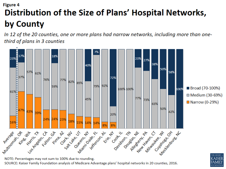
The breadth of hospital networks, and the availability of broad, medium, and narrow network plans, varied greatly across the 20 counties included in the study (Figure 4 and Table A1). Plans with broad networks were available in 11 of the 20 counties, and comprised at least half of the plans available in 4 counties (Milwaukee, Cuyahoga, Erie, and Mecklenburg), including one county (Mecklenburg) in which all plans had broad networks of hospitals. However, in nine of the 20 counties, beneficiaries did not have access to a broad network plan. In 12 of the 20 counties, one or more Medicare Advantage plans had narrow networks, including more than one-third of plans in 3 counties (Multnomah, King, and Harris).
By Number of Hospitals in the County
The share of narrow network plans in a county does not appear to be related to the number of hospitals in the county. While some of the counties with narrow network plans, such as Multnomah, have relatively few hospitals, other counties with narrow network plans, such as Los Angeles and Harris counties, have many hospitals. For example, three plans in Los Angeles County included only 5 of the 106 hospitals in the county and one plan in Harris County included only 2 of the 70 hospitals in the county.
By Per Capita Medicare Spending
Per capita Medicare spending does not appear to be associated with the size of hospital networks offered by plans in a given county. The presence of narrow network plans does not appear to be related to whether per capita Medicare spending is relatively high or low in the county. For example, narrow networks plans are available in Miami-Dade and Harris counties, both of which have historically had very high per capita Medicare spending, and in Multnomah and Erie counties, which have historically had low per capita Medicare spending. In each of the 20 counties, regardless of per capita Medicare spending, beneficiaries have the option of enrolling in a plan that does not have a narrow network. This finding suggests that plans in high-cost areas are no more likely than those in low-cost areas to use limited provider networks to reduce their costs.
By Enrollment
The distribution of plans by network size is generally similar to the distribution of enrollees by network size, indicating that beneficiaries are neither disproportionately enrolled in broad networks nor narrow networks (Figure 5 and Table A1). About one in six Medicare Advantage enrollees (16%) were in plans with narrow networks, two-thirds (66%) were in plans with medium networks, and 18 percent were in plans with broad networks. In most of the counties in the study, beneficiaries could choose only between broad and medium plans (5 counties) or between medium and narrow plans (7 counties). (In Mecklenburg, beneficiaries could only choose among broad network plans, and in Davidson and Cook, beneficiaries could only choose among medium network plans.) In 2 of the counties (Erie and Queens) with broad, medium and narrow networks, beneficiaries were disproportionately enrolled in broad network plans, but in the other 3 counties (Fulton, Miami-Dade, and Multnomah), enrollment in broad network plans was relatively proportionate to the availability of broad network plans in the county.
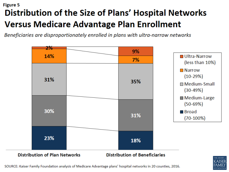
Figure 5: Distribution of the Size of Plans’ Hospital Networks Versus Medicare Advantage Plan Enrollment
HMOs Versus PPOs
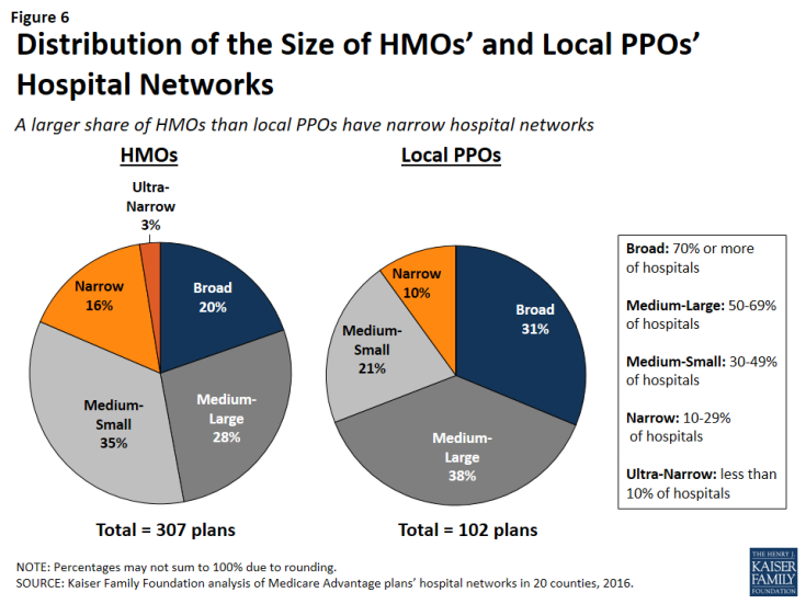
HMOs tend to have narrower hospital networks than PPOs, across the 20 counties studied (Figure 6). In most counties, a larger share of local PPOs had broad networks, and a larger share of HMOs had narrow networks (Tables A3 and A4).
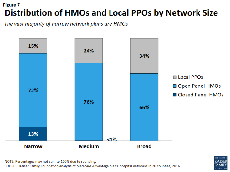
Since about three-quarters of the plans included in this study were HMOs, HMOs comprised the majority of plans across all network sizes (Figure 7). However, a disproportionately large share (85%) of narrow and ultra-narrow network plans were HMOs (either closed panel or open panel HMOs) while only two-thirds of broad network plans were HMOs. Similarly, PPOs comprised a smaller share of narrow network plans (15%) than broad network plans (34%).
In some cases, HMOs and local PPOs offered by the same firm in a market shared the same network, although the structure of PPOs provides some coverage for the cost of care at hospitals not in the network.2 About one-third (37%) of local PPOs shared a provider network (and provider directory) with at least one HMO offered by the same firm.
Closed Versus Open Panel HMOs
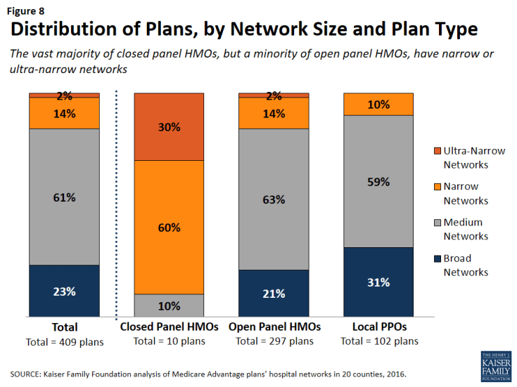
Most HMOs have open panel designs in which the parent organization has non-exclusive contracts with a range of providers located in the area, and the providers typically accept multiple insurers. A small share of HMOs have closed panel designs in which the parent organization has exclusive contracts with physicians (employed either directly or in groups) and sometimes also owns hospitals or contracts with hospitals in other ways that result in more centralized hospital capacity. While the data available to distinguish between closed and open panel HMOs are limited, such data suggest that only ten plans in our study had closed panel designs (Figure 8 and Table A5). Five of the ten plans were offered by Kaiser Permanente in Los Angeles, Multnomah, and Fulton, and typically had narrower networks than other plans, consistent with their design. The other five closed-panel HMOs were offered by Group Health Cooperative in King County and Leon Medical Centers in Miami-Dade County, both of which included a larger share of hospitals in the county than Kaiser Permanente.
With the exception of Leon Medical Centers, which had a medium-sized network, all of the other nine closed-panel HMOs had narrow or ultra-narrow networks (as compared to only 16 percent of open-panel HMOs). However, closed-panel HMOs comprised a small share of all narrow or ultra-narrow network plans, and only nine of the 67 plans with narrow or ultra-narrow networks (13%) were closed panel HMOs (Figure 8). The fact that closed-panel HMOs typically have narrow networks is by design; they often operate as systems of care, where the hospitals are often owned by the parent company and used primarily if not exclusively by members. Despite the comparatively narrow networks of many of these closed-panel HMOs, they generally attract a relatively large number of beneficiaries.
Inclusion of Teaching Hospitals and Cancer Centers
While high quality medical care can be provided in a variety of hospital settings, some conditions can benefit from care provided in certain types of facilities. Access to specialized medical care is also important to many Medicare beneficiaries since about one-quarter (26%) of Medicare beneficiaries are in fair or poor health and 45 percent have four or more chronic conditions.3 Academic Medical Centers are more likely than minor teaching hospitals or other hospitals to have physicians specializing in rarer conditions or operations, such as liver or bone-marrow transplants, autoimmune disorders such as lupus, or other complex medical conditions. Academic Medical Centers are also more likely to conduct more surgeries, such as heart surgery, for which better outcomes have been linked to higher volumes of surgeries. Both Academic Medical Centers (also known as major teaching hospitals) and minor teaching hospitals have residency and/or internship training programs (or medical school affiliation reported by the American Medical Association) but, unlike Academic Medical Centers, minor teaching hospitals are not members of the Council of Teaching Hospitals.
Access to high quality cancer treatment is also important to many Medicare beneficiaries since the incidence of cancer is more than 10 times higher among people ages 65 and older than among younger people.4 To gain insight into the type of cancer treatment available to Medicare Advantage enrollees, this study examined access to cancer centers designated by the National Cancer Institute (NCI) and hospitals accredited by the American College of Surgeons (ACS). The NCI has designated 69 cancer centers in 35 states as NCI-Designated Cancer Centers in recognition of their leadership and resources in the development of more effective approaches to prevention, diagnosis, and treatment of cancer, and many but not all of these centers are affiliated with Academic Medical Centers. The ACS Commission on Cancer accredits cancer programs within hospitals that meet ACS quality and service standards, and this accreditation is designed to be an indicator of higher quality cancer care.
Academic Medical Centers and Minor Teaching Hospitals
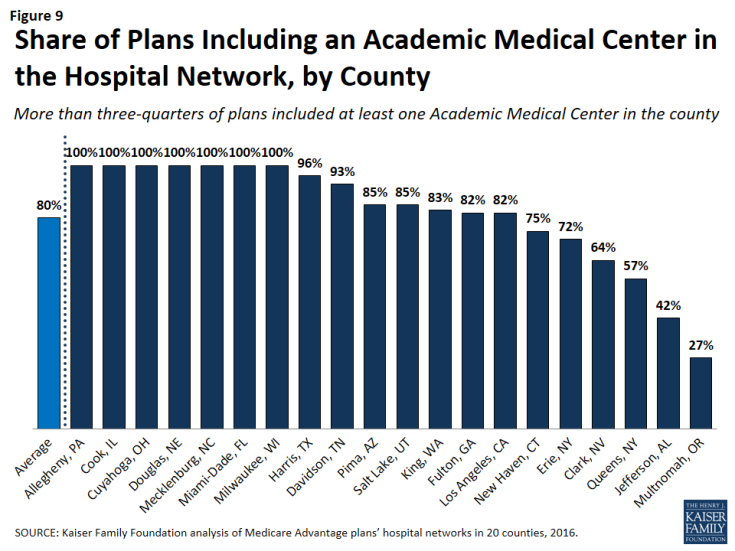
More than three-quarters (80%) of all Medicare Advantage plans analyzed in this study included at least one Academic Medical Center in the county in its network of hospitals, including 78 percent of HMOs and 88 percent of PPOs (Figure 9). Another 6 percent of plans included an Academic Medical Center in the adjacent county but not in the county studied (not shown). In total, 86 percent of plans included an Academic Medical Center in the primary county or in a bordering county. Additionally, the vast majority of plans (92%) included at least one minor teaching hospital in the county, including all of the plans in 14 counties. In 15 of the 20 counties, more than three-quarters of the plans included an Academic Medical Center, including 7 counties in which all of the plans included an Academic Medical Center in the provider network (Table A6). However, in 2 counties (Jefferson and Multnomah), less than half of all Medicare Advantage plans included the Academic Medical Center in the county.
Larger plans were more likely to include an Academic Medical Center, on average, and as a result a somewhat larger share (91%) of Medicare Advantage enrollees are in a plan that includes an Academic Medical Center in its network.
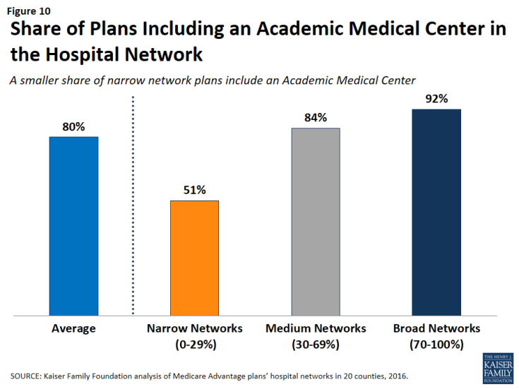
The vast majority (92%) of broad network plans included an Academic Medical Center, while a much smaller share of plans with narrow networks (51%) included an Academic Medical Center (Figure 10). In most counties, a larger share of plans with broad networks than plans with narrow networks included at least one Academic Medical Center (Table A7).
Cancer Centers
NCI-Designated Cancer Centers tend to have greater access to clinical trials, especially early-stage clinical trials, than community hospitals and other treatment centers. While many hospitals in a community are likely to be able to treat multiple types of cancer, access to NCI Cancer Centers may be particularly relevant to beneficiaries with rarer cancers, more advanced-stage cancers, or other unique complicating conditions.
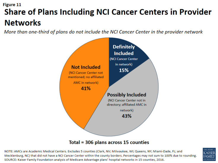
NCI-Designated Cancer Centers. Among the 15 counties with an NCI Cancer Center, 15 percent of Medicare Advantage plans listed the NCI Cancer Center in the provider directory, 43 percent of plans included the Academic Medical Center with which the center was affiliated (but did not explicitly indicate that the cancer center was included), and 41 percent did not include the NCI Cancer Center in the county among providers listed in the directory (Figure 11 and Table A7).
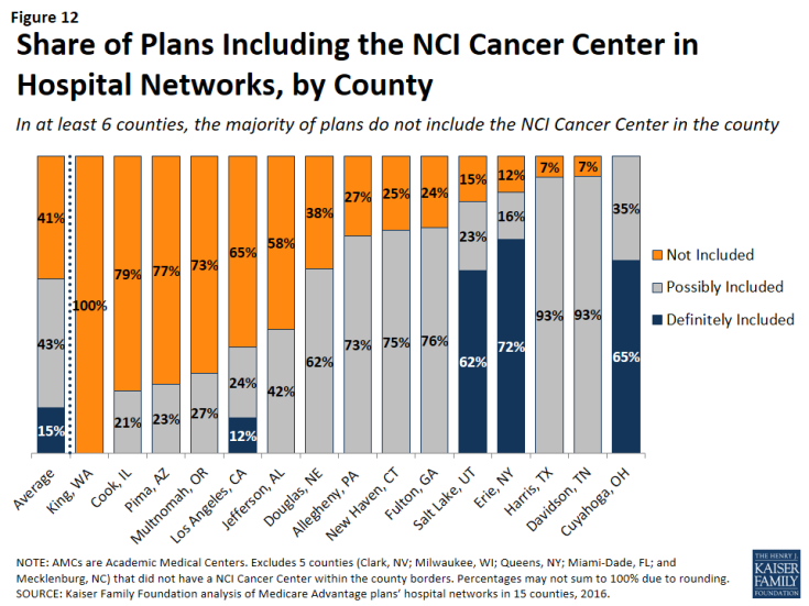
In 6 of the 15 counties with an NCI Cancer Center, the majority of Medicare Advantage plans did not include the NCI Cancer Center in its provider network (Figure 12).
This lack of clarity as to whether an NCI Cancer Center is included in a plan’s provider network may be attributable to the considerable variation in the way in which the cancer centers are listed in the plans’ provider directories. For example, the Huntsman Cancer Institute in Salt Lake County is affiliated with the University of Utah and is located across the street from their main Academic Medical Center. Some of the provider directories for Medicare Advantage plans offered in Salt Lake County list Huntsman Cancer Center explicitly, in addition to listing the University of Utah Medical Center, but other provider directories only list the University of Utah Medical Center, and do not mention the Huntsman Cancer Institute. In these situations, it is unclear whether a Medicare beneficiary can assume that coverage of care at the Academic Medical Center includes care at the affiliated cancer center, and the answer most likely varies across plans.
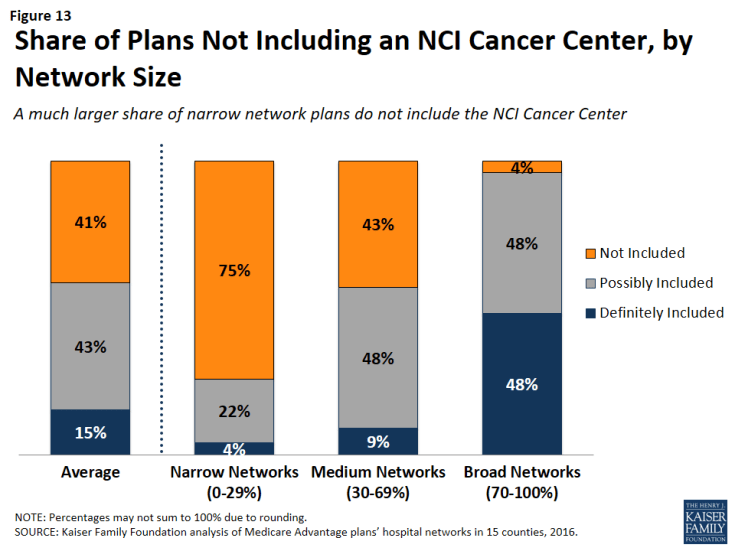
NCI Cancer Centers were less likely to be included in plans with narrow networks than plans with broader networks (Figure 13). These results were generally consistent across the counties.
Even when NCI-Designated Cancer Centers are excluded from the provider network, plans may choose to selectively refer enrollees to them, when appropriate, although it is beyond the scope of this analysis to assess the extent to which these referrals occur. Contract negotiations with cancer centers can be complex, particularly when a cancer center is in a strong negotiating position, which may explain why many plans do not include them in the plan networks.
ACS-Accredited Cancer Programs. The vast majority of plans (94%) included at least one hospital with a cancer program accredited by the ACS Commission on Cancer. A larger share (21%) of narrow network plans than medium (4%) or broad network plans (0%) did not include at least one hospital with a cancer program accredited by the ACS (Figure 14). Plans’ inclusion of hospitals with ACS-accredited cancer programs also varied somewhat across counties. In 13 counties, every plan included at least one hospital with an ACS-accredited cancer program, while 12 percent of plans in Los Angeles did not include such a hospital in their network; however, in all counties, most of the plans without a hospital with an ACS-accredited cancer program had narrow networks.
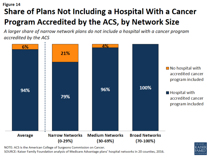
Figure 14: Share of Plans Not Including a Hospital With a Cancer Program Accredited by the ACS, by Network Size
Overall, 3 percent of plans had neither a hospital with an ACS-accredited cancer program nor an NCI Cancer Center in their provider network. While few beneficiaries are evaluating provider networks based on their access to cancer centers, if beneficiaries wanted to know whether a network included hospitals affiliated with an NCI Cancer Center or hospitals with ACS-accredited cancer programs, they would need to use data sources other than the provider directory because these designations are not indicated in the directories.
Other Specialty Units and Facilities
For specialty care more broadly, unless the affiliate is explicitly mentioned in the provider directory, it is unclear whether a hospital’s affiliates are also covered by a plan, or whether coverage is restricted to acute care hospitalization at the specific hospital listed in the directory. For example, it is often unclear as to whether a hospital’s affiliated heart center, rehabilitation center, or women’s center is included in the plan network that includes the main, acute care hospital. This lack of clarity makes it difficult for beneficiaries to determine which affiliated providers would be in a plan’s network.
Relationship Between Breadth of Network and Other Plan Features
Plan Premiums by Network Size
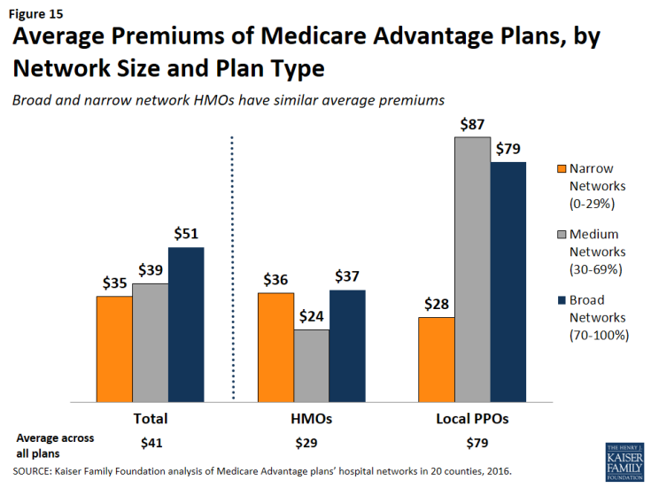
Average premiums for Medicare Advantage plans generally increased with the size of the network (Figure 15). The average premium for Medicare Advantage plans with broad networks ($51 per month) was almost 50 percent higher than the average premium for narrow network plans ($35 per month).
However, the correlation between premiums and network size disappeared after comparing networks within plan types. Among HMOs, the average premium for narrow network plans ($36 per month) was the same as the average premium for broad network plans. Among PPOs, the average premium for narrow network plans is much lower ($28 per month) than for medium network plans ($87 per month) and broad network plans ($79 per month). However, since only 10 local PPOs had narrow networks, more research with a larger sample of narrow network local PPOs is needed to confirm these findings. Overall, premiums varied more between HMOs and local PPOs than by network size.
Star Quality Ratings by Network Size
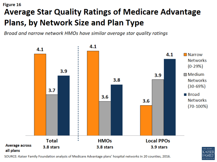
The size and composition of the plans’ provider networks are not used by CMS to assign star quality ratings to the plans; however, the ratings may nonetheless be correlated with the size of the networks if the hospitals excluded from the narrower networks had either a positive or negative effect on plan ratings. Overall, the average star quality ratings for narrow network plans (4.1 stars) were similar to the average ratings for medium or broad network plans (3.7 and 3.9 stars, respectively; Figure 16).
Within counties, the relationship between plan ratings and network sizes was inconsistent. In some counties, narrow network plans had higher average quality ratings than medium or broad network plans, but in other counties the narrow network plans had lower average quality ratings.
Among local PPOs, the average plan ratings generally increased with the size of the network, and plans with broader networks had somewhat higher average ratings (4.1 stars) than plans with narrow networks (3.6 stars). However, more research with a larger sample of narrow network local PPOs is needed to confirm these findings since only 10 local PPOs in our study had narrow networks. Among HMOs, there was a different dynamic between plan ratings and the size of the network, and narrow network HMOs had higher plan ratings (4.1 stars) than HMOs with broad networks (3.8 stars). Taken as a whole, the relationship between plans’ quality ratings and the size of plans’ networks is likely more closely related to factors other than the size of plans’ networks.
Firm as a Predictor of Network Size
Among the firms offering plans in these 20 counties, none were more likely than others to have narrow networks in multiple counties, with the exception of Kaiser Permanente, which only has narrow hospital networks (Table A8). For example, while Humana included more than 70 percent (broad network) of the hospitals in Mecklenburg, it had narrow provider networks in 5 counties (Harris, Los Angeles, Multnomah, Queens, and Salt Lake) and medium networks in 12 other counties. Likewise, some Blue Cross Blue Shield (BCBS) affiliated plans had broad hospital networks in some counties (e.g., Cuyahoga, Miami-Dade), but had narrow hospital networks in other counties (e.g., Harris).
Interestingly, among plans with the same name that were offered in multiple counties, the size of the plan network often varied across counties. For example, the Humana Choice plan in Multnomah, Oregon included only 13 percent of the hospitals in the county, whereas the Humana Choice plan in Cuyahoga, Ohio included 70 percent of the hospitals in the county. As a consequence, enrollees cannot use the firm or the plan name as a signal about the size of the plan network. This finding also suggests that local market characteristics typically are a stronger influence on network design than particular firm philosophies.
Size of Hospitals by Network Size
The size of the hospitals (measured by the number of beds) included in provider networks could provide some information about the plan’s capacity to provide inpatient care to enrollees, and may have some relationship to the quality of care and enrollees’ satisfaction with their care, although the evidence for this is mixed. Several studies have found that larger hospitals have lower mortality rates than smaller hospitals;5 however, patients have also rated lower their satisfaction with the care received at large hospitals than at smaller hospitals.6
Across the 20 counties, Medicare Advantage plans were more likely to include larger hospitals (400 beds or more) than smaller hospitals (less than 100 beds). While 17 percent of all hospitals in the 20 counties were large hospitals, they accounted for 29 percent of all hospitals in the plans’ provider networks (Figure 17).
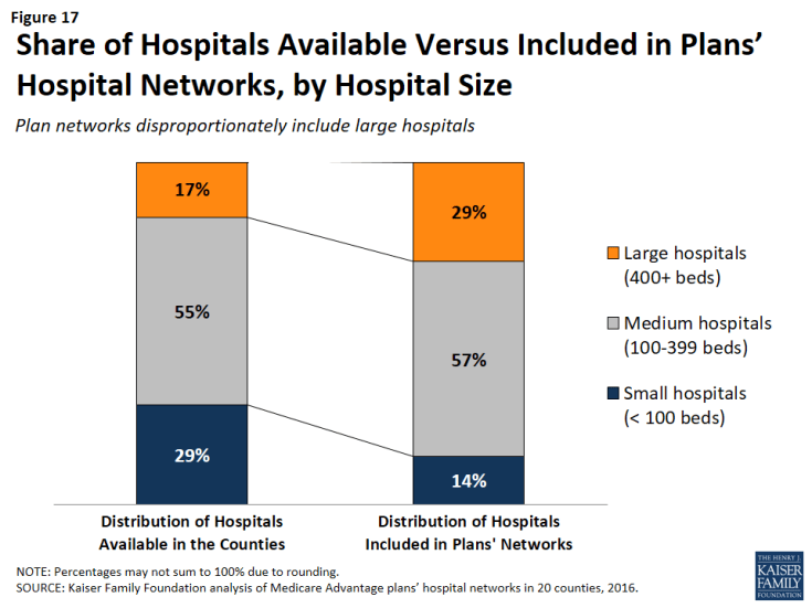
Figure 17: Share of Hospitals Available Versus Included in Plans’ Hospital Networks, by Hospital Size
Similarly, while 29 percent of all hospitals were small, these hospitals accounted for only 14 percent of the hospitals in the plans’ provider networks. These findings were generally consistent at the county-level, and, in all counties, large hospitals were either over-represented or proportionately represented in plan networks.
Network size did not appear to be correlated with the size of the hospitals included in the network. Large hospitals comprised more than one-third of hospitals in both narrow and broad network plans (37% and 35%, respectively), but a smaller share (23%) of hospitals in medium networks.
Ownership of Hospitals by Network Size
Most hospitals operate on a not for profit basis, so it is not surprising that such hospitals also constituted most of the hospitals in plans’ networks. However, relative to their prevalence in the counties, plan networks were less likely to include for-profit hospitals, which accounted for 39 percent of the hospitals in the counties, but only one-quarter (26%) of the hospitals in the plan networks. These findings generally are consistent across the individual counties studied.
Plan Tax Status by Network Size
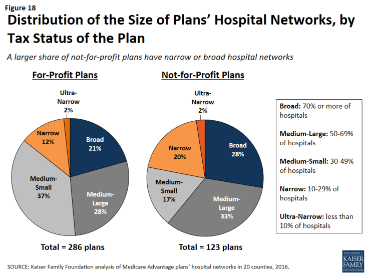
In theory, a plan’s tax status could influence the firm’s approach towards creating the plan’s provider network, since not-for-profit plans may be able to dedicate a larger share of their revenue towards payments to providers and benefits for enrollees. A larger share of not-for-profit plans (28%) than for-profit plans (21%) had broad hospital networks (Figure 18). At the same time, a larger share of not-for-profit plans (22%) than for-profit plans (15%) had narrow or ultra-narrow hospital networks. These findings greatly varied across counties, and not-for-profit plans did not consistently have narrower or broader networks than for-profit plans in the same county.

