Medicaid Per Enrollee Spending: Variation Across States – Issue Brief – 8550
Medicaid, the nation’s public health insurance program for low-income people, covers health and long-term care services for over 66 million Americans. Medicaid beneficiaries include many children, working families, low-income elderly, and individuals with disabilities. To participate in Medicaid, states are required to meet federal core requirements; however, states have significant flexibility to expand beyond program minimums for benefits and coverage, to determine how care is delivered and to determine what and how providers are paid. As a result of this flexibility, there is significant variation in Medicaid programs across states. Beyond policy choices, other factors such as a state’s ability to raise revenue, the need for public services, the health care markets in which Medicaid operates as well as the policy process all lead to variation in Medicaid programs and spending. While the program structure is designed to promote flexibility and variation in Medicaid across states, the extent of this variation is not well understood. This brief examines variation in spending per enrollee across eligibility groups, across states and over time, as well as implications for program policy and financing.
How Does Medicaid Per Enrollee Spending Vary Across Eligibility Groups and States?
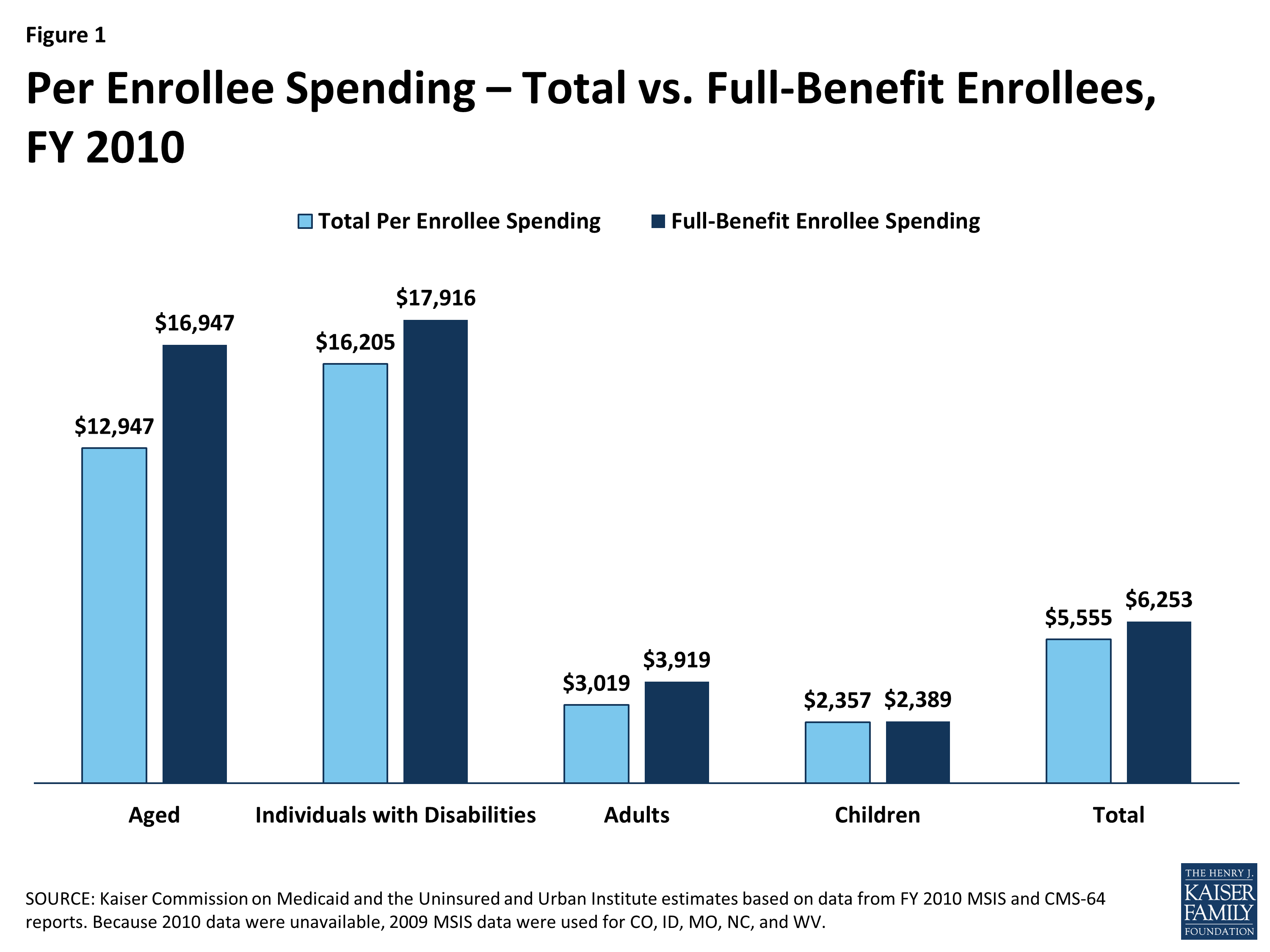
Figure 1: Per Enrollee Spending – Total vs. Full-Benefit Enrollees, FY 2010
The simple calculation for per enrollee spending takes total spending for services and divides by total Medicaid enrollment (the number of Medicaid enrollees ever enrolled over the course of a year). For FY 2010, per enrollee spending averaged $5,555. This same calculation can be applied across eligibility groups. These calculations do not account for the fact that some Medicaid enrollees are only eligible for “partial benefits”. For example, “partial benefit enrollees” include those eligible for family planning services only or those that are partial duals (i.e. those for whom Medicaid pays for only Medicare premiums and cost sharing but not other Medicaid services). Eliminating partial benefit enrollees provides a better understanding of the true cost of a full-benefit Medicaid enrollee. Eliminating partial benefit enrollees generally increases the calculations for per enrollee spending (because partial benefit enrollees tend to be less expensive than full-benefit enrollees). This is particularly true for the group of aged beneficiaries (due to the exclusion of partial duals where Medicare is the primary payor). (Figure 1).
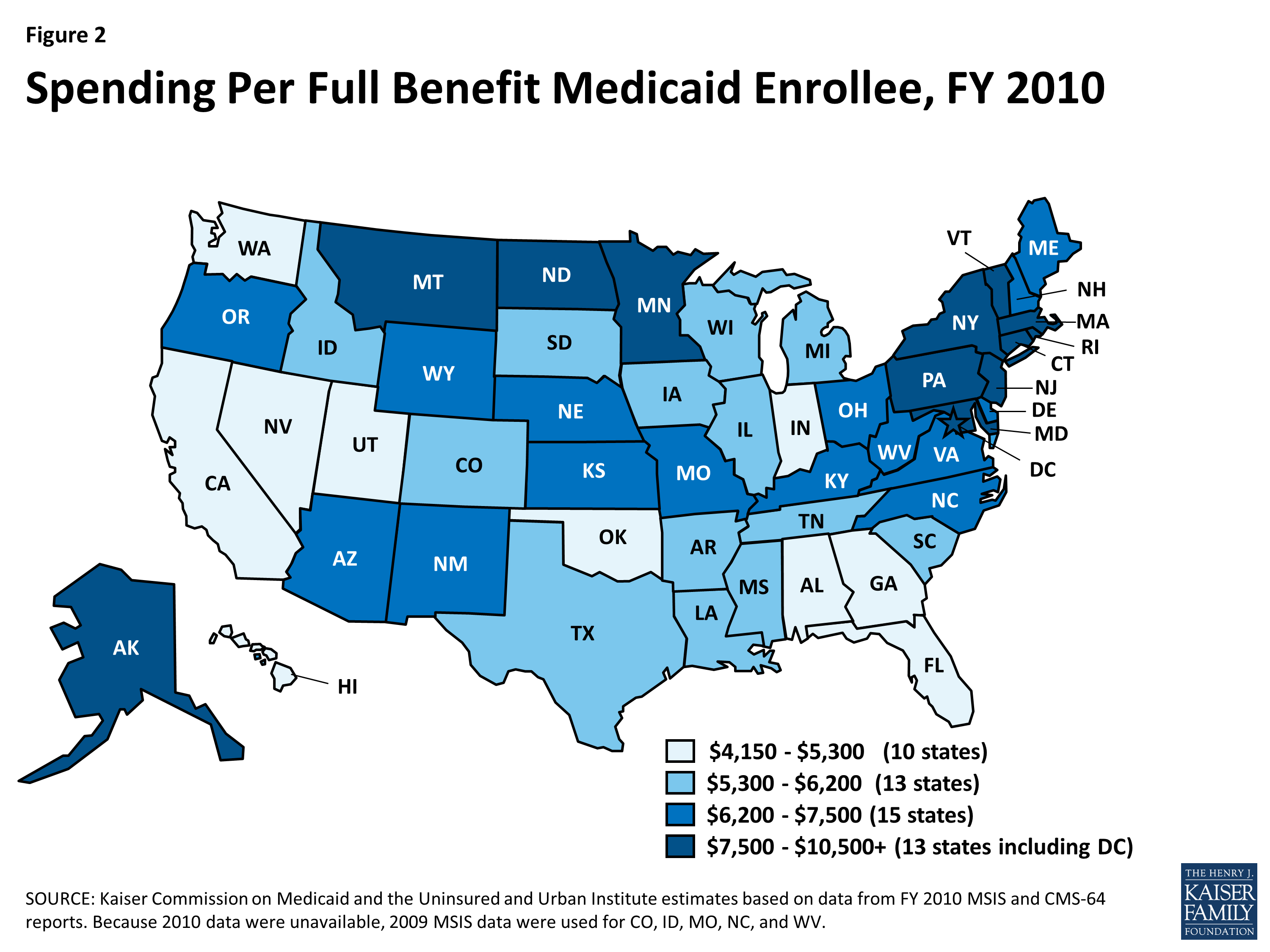
Figure 2: Spending Per Full Benefit Medicaid Enrollee, FY 2010
Elimination of the partial benefit enrollees also has different implications across states. In general, the exclusion of partial benefit enrollees increases per enrollee spending by about 12 percent. While the differential is small for most states, however, there is a large differential in a few states including California (39%), Massachusetts (30%), Vermont (28%) and Alabama (24%). The rest of the discussion in this brief uses spending per full-benefit enrollee. Across all states, per full-benefit enrollee spending averaged $6,253 in FY 2010 and ranged from $4,151 in Georgia to $10,509 in New York. In general, states in the south tend to have lower per enrollee spending, while states in the northeast tend to have higher per enrollee spending. (Figure 2).
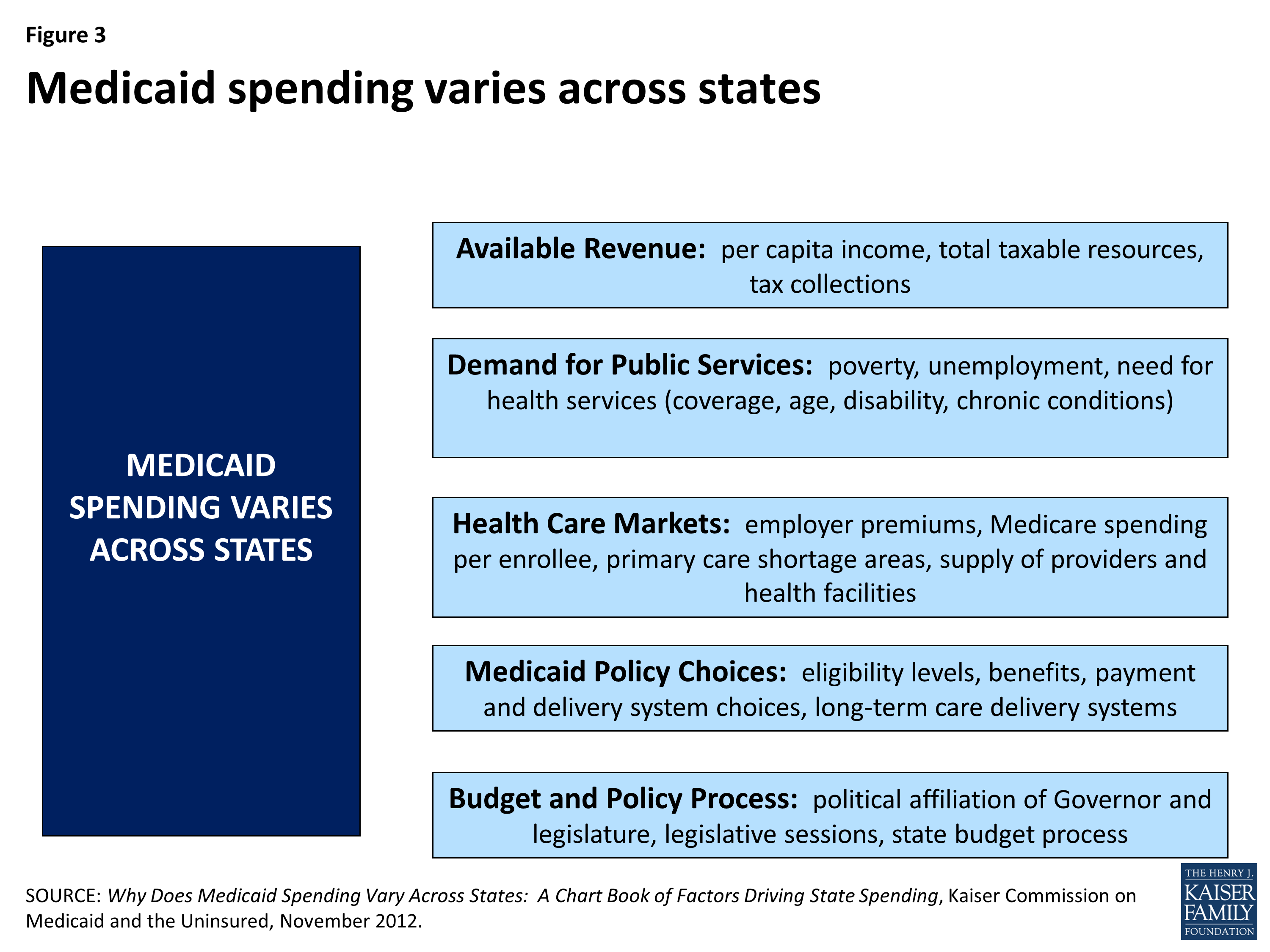
Figure 3: Medicaid spending varies across states
The reasons for this variation are not uniform or easy to explain. Variation is the result of a complex set of factors that include state policy choices (who is eligible, what benefits are covered, how services are paid for and delivered) as well as the availability of revenues, demand for service, health care markets and state budget and policy processes.1 (Figure 3).
Average per enrollee spending varies significantly across states and also across eligibility groups. Per enrollee spending is higher for the aged and individuals with disabilities and lower for adults and children eligibility groups. The aged and individuals with disabilities use more complex acute care services as well as long-term care services. Spending per aged enrollee ranges from a low of $10,101 in California to a high of $31,318 in Connecticut; from $9,099 in Alabama to $33,552 in the New York for disabled enrollees; from $2,032 in California to $6,928 in New Mexico for adult enrollees and from $1,575 in Indiana to $4,804 in Alaska for children. (Figure 4).
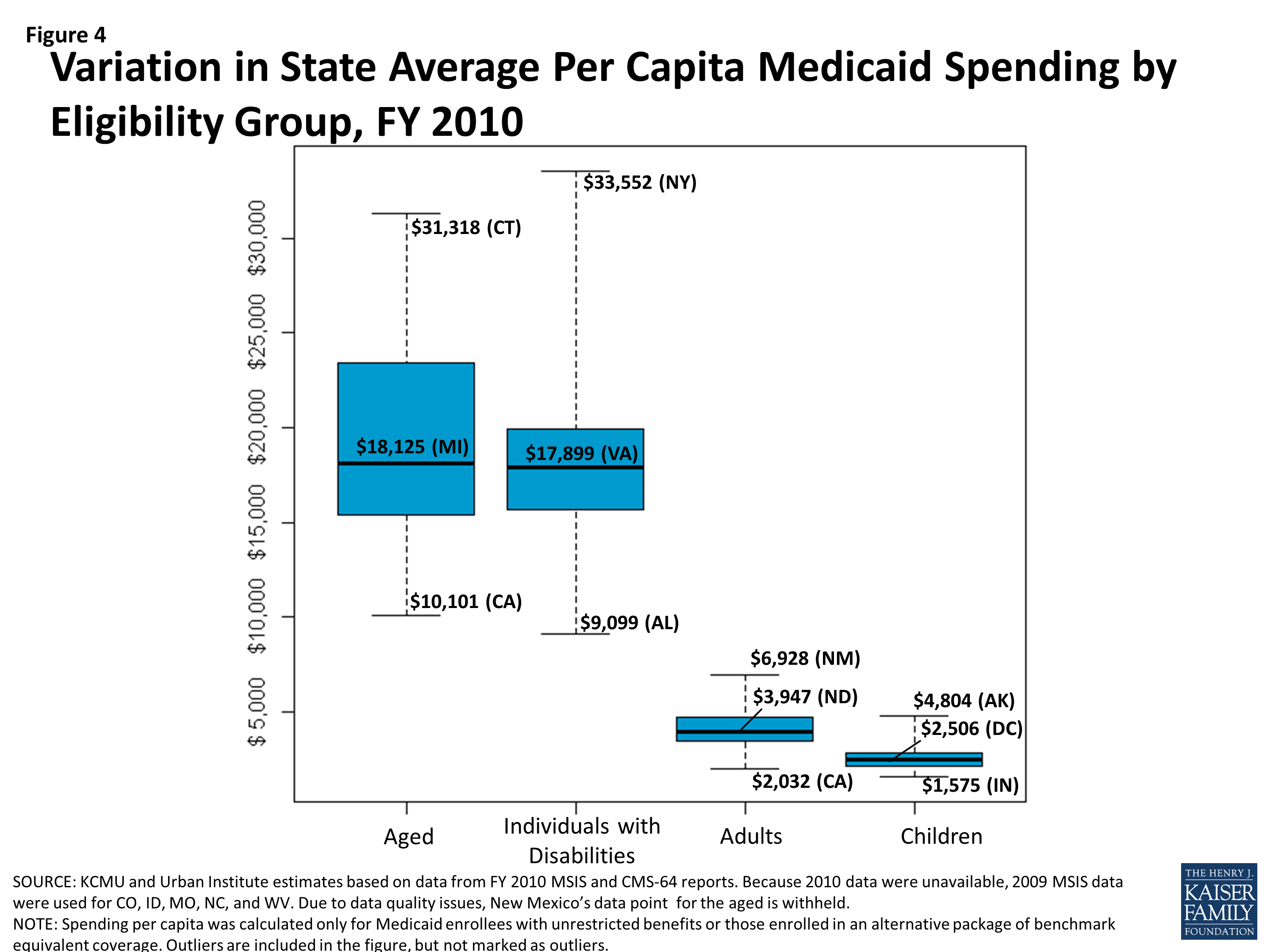
Figure 4: Variation in State Average Per Capita Medicaid Spending by Eligibility Group, FY 2010
Even in states that have average spending close to the national average, spending varies widely within the eligibility group within the state. For example, average Michigan spending per aged enrollee is $18,125 but this ranges from an average of $506 for those in the first quartile to $95,879 for those in the top 5th percentile of spending. The variation is even greater for spending per disabled enrollee in Virginia – ranging from $428 for those in the first quartile to $134,700 for those in the top 5th percentile. Despite the general lower cost for child enrollees, the variation in spending per child was wide in the District of Columbia due to the variation in fee-for-service spending for the 10 percent of children not enrolled in comprehensive managed care, the variation in monthly premiums for the 90 percent of children in managed care, and the effect of partial year enrollment on yearly premium totals and total fee-for-service spending for those not enrolled in managed care.
| Average Spending Per Enrollee by Percentile in Select States, FY 2010 | ||||
| Percentile | Aged in Michigan | Individuals with Disabilities in Virginia | Adults in Alabama | Children in D.C. |
| 0-25% | $506 | $428 | $561 | $571 |
| >25-50% | $1,801 | $5,144 | $1,825 | $1,398 |
| >50-75% | $9,176 | $13,503 | $3,570 | $1,496 |
| >75-90% | $45,199 | $24,248 | $6,335 | $2,185 |
| >90-95% | $73,621 | $55,166 | $9,597 | $4,786 |
| >95% | $95,879 | $134,700 | $21,263 | $21,458 |
| Note: We selected states with spending per enrollee for the given eligibility group that was at or close to the national median. Source: Kaiser Commission on Medicaid and the Uninsured and Urban Institute estimates based on data from FY 2010 MSIS and CMS-64 reports. |
||||
How Has Growth In Medicaid Per Enrollee Spending Varied Across Eligibility Groups and States?
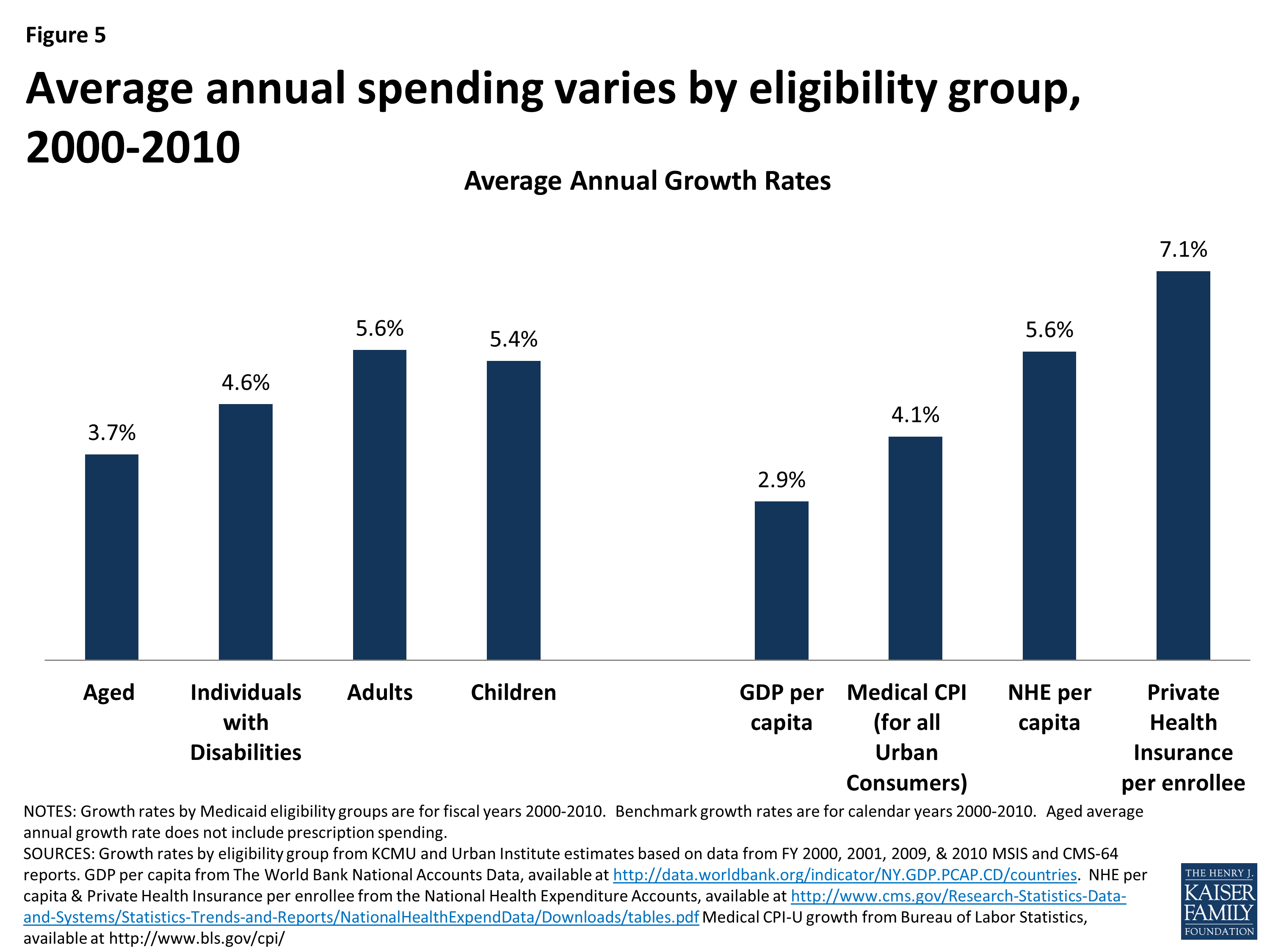
Figure 5: Average annual spending varies by eligibility group, 2000-2010
As described above, the levels of per enrollee spending vary considerably across eligibility groups. While not as dramatic, per enrollee spending growth rates also vary across groups. Looking at average annual spending growth for per enrollee spending by eligibility group – spending for the aged, excluding prescription drug spending, grew more slowly than other groups over the period.2 Spending for children and adults grew faster than other groups, however, these groups are typically lower cost groups than the aged and individuals with disabilities. Growth in Medicaid spending per enrollee from 2000 to 2010 was generally greater than GDP and Medical CPI, but lower than measures of private health care spending per capita as measured by NHE per capita and private health insurance per enrollee. (Figure 5).3
However, as there is wide per enrollee spending variation across eligibility groups, there is also wide growth rate variation across the states within each eligibility group. (Figure 6).
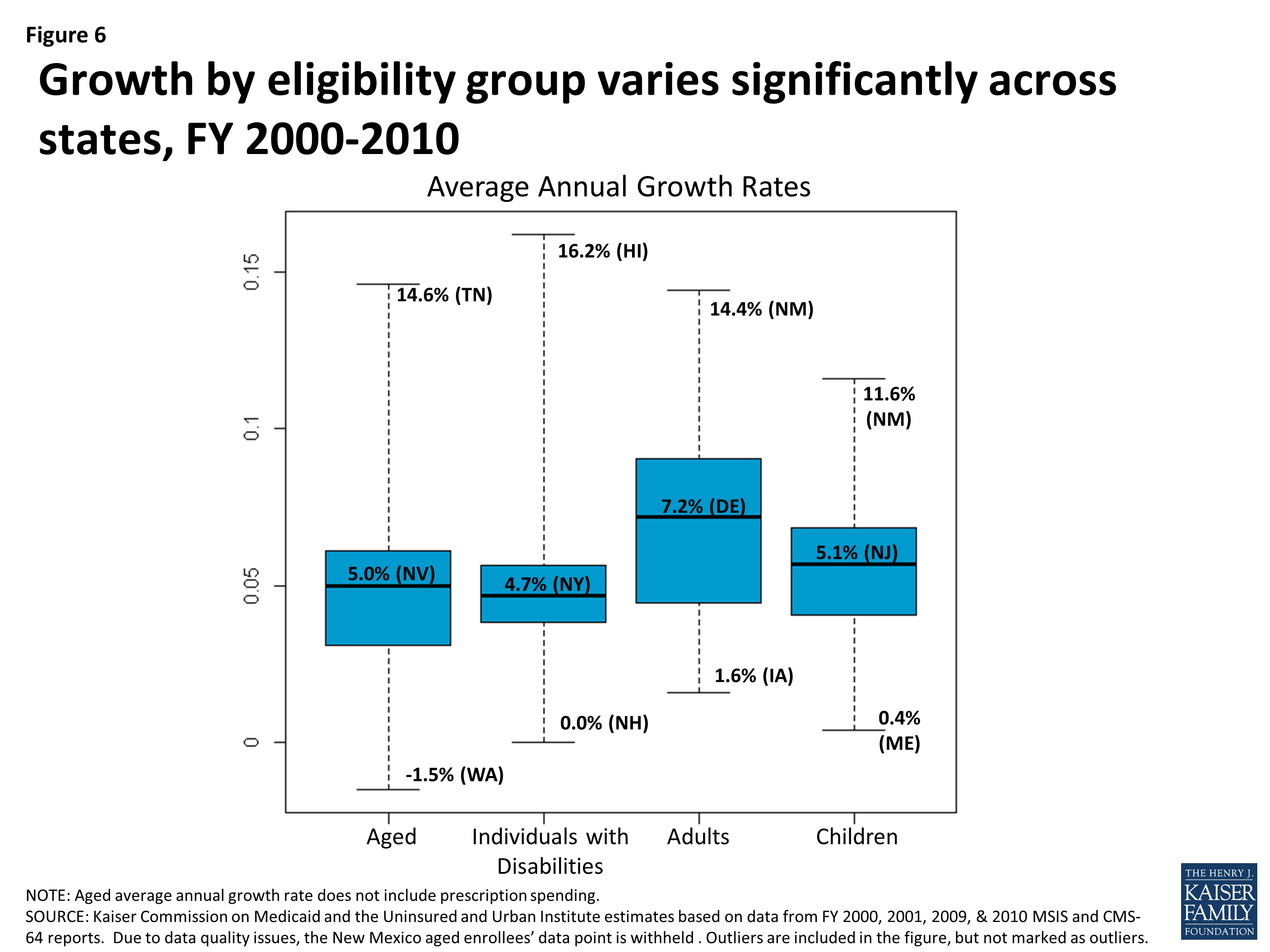
Figure 6: Growth by eligibility group varies significantly across states, FY 2000-2010
Further, within each eligibility group, states with low spending per enrollee tend to grow faster than states with higher spending per enrollee. This is shown in Figures 7 through 10, where for each eligibility group, we plot the spending per enrollee in FY 2000 against the average annual growth rate from FY 2000 through FY 2010. We divide these plots into four quadrants by drawing the unweighted national average annual growth rate, and the unweighted national average spending per enrollee (the orange lines). We can see that states with FY 2000 spending per enrollee above the unweighted national average- that is to say, states to the right of the vertical orange line in Figures 7 through 10- tend to have grown more slowly over the following decade. These states are in the bottom right quadrant. On the other hand, states in the top left quadrants represent the states with FY 2000 spending per enrollee that was below the national average, but that grew faster than the national average annual growth rate.

Figure 7: Aged Enrollees: Comparing the Average Annual Growth Rate of Spending, Excluding Rx, from FY 2000-2010 to Spending Excluding Rx Per Enrollee in FY 2000
Figures 7 through 10 show us that the level of per enrollee spending in FY 2000 is inversely correlated with the average annual growth rate over the FY 2000 – 2010 period. By calculating the correlation coefficients between the spending per enrollee and average annual growth rates, we can see numerically what figures 7 through 10 show us visually. The correlation coefficient is a statistical tool that tells us how close our plots in figures 7 through 10 are to straight lines. In other words, they tell us how well we can predict the average annual growth rate knowing just the spending per enrollee in FY 2000. The negative number confirms that there is an inverse correlation between the two. With correlation coefficients ranging from -.4 to -.6 for all four groups, we classify spending per enrollee in 2000 and the average annual growth rate from FY 2000 – 2010 as moderately strong overall. Comparing between the eligibility groups, we see that with correlation coefficients of -.600 and -.598, spending per enrollee and average annual growth rates are more strongly linearly correlated for the aged (excluding prescription spending) and individuals with disabilities, than for adults and for children.4
| Correlation Coefficients Between Spending Per Enrollee in FY 2000 and Average Annual Growth Rates from FY 2000 – 2010 | |
| Basis of Eligibility Group | Correlation Coefficient |
| Aged Enrollees, Excluding Prescriptions | -0.600 |
| Individuals with Disabilities | -0.598 |
| Adults | -0.452 |
| Children | -0.436 |
| Source: Kaiser Commission on Medicaid and the Uninsured and Urban Institute estimates based on data from FY 2000, 2001, 2009, & 2010 MSIS and CMS-64 reports. | |

Figure 8: Individuals with Disabilities: Comparing the Average Annual Growth Rate of Spending, from FY 2000-2010 to Spending Per Enrollee in FY 2000
The correlation between spending per enrollee and average annual growth is partially due to the fact that the same change in spending will comprise a larger share of a small per enrollee spending level in a base year than it would of a large per enrollee spending level. However, it may also be attributable to state policy changes to benefits provided. Regardless, the correlation coefficients show us that states with lower spending per enrollee in a base year have experienced higher average annual growth rates, especially amongst the aged and individuals with disabilities eligibility groups. Thus we see that not only does spending per enrollee grow differently based upon the eligibility group, but that within each eligibility group spending per enrollee grows differently across states, that the level of spending in the base year is correlated with the rate of growth in the subsequent years, and the strength of this correlation varies across eligibility groups.
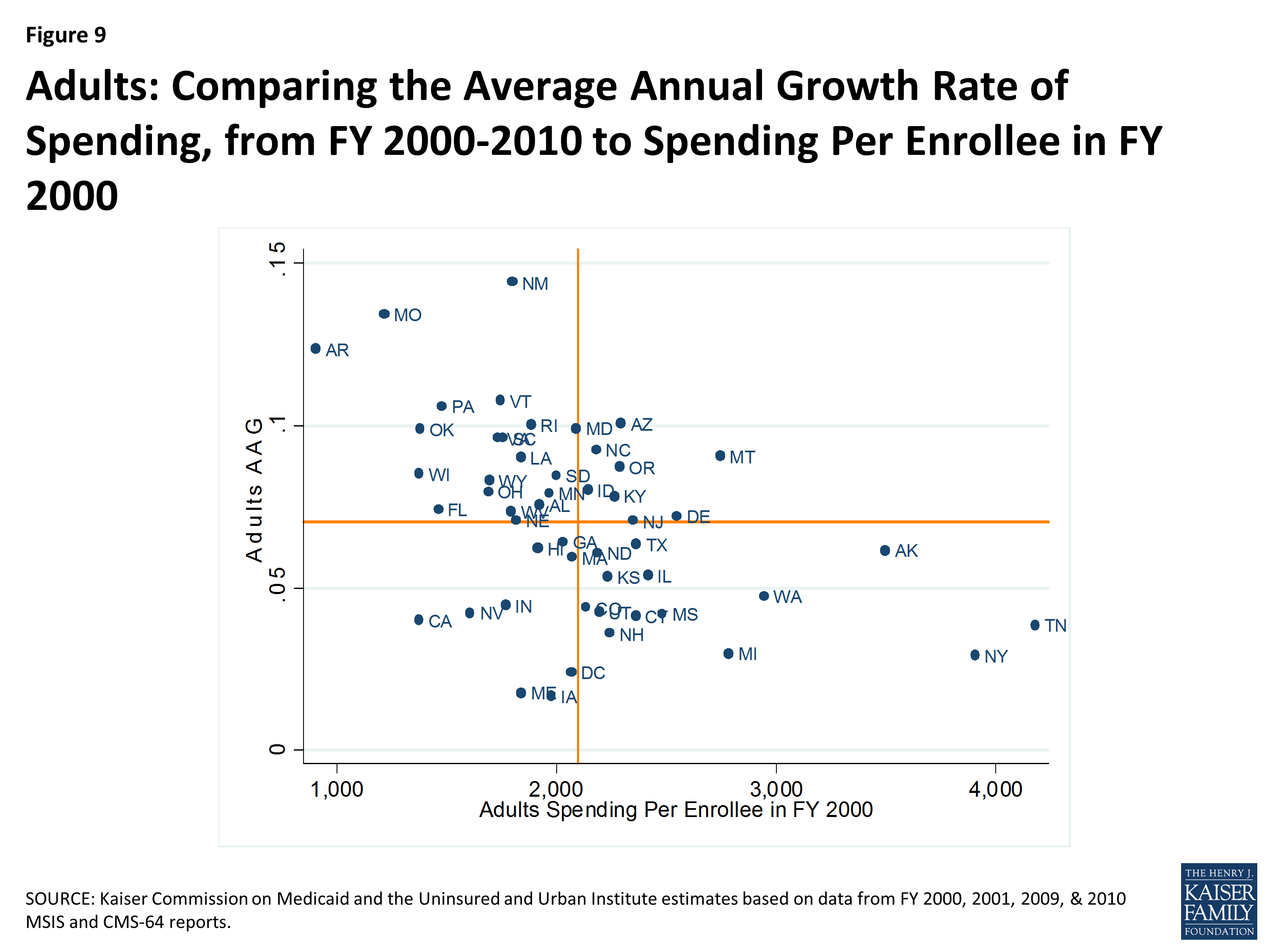
Figure 9: Adults: Comparing the Average Annual Growth Rate of Spending, from FY 2000-2010 to Spending Per Enrollee in FY 2000
Why Does Variation in Spending Matter?
Over the last several years there has been an intense focus on federal deficit reduction. A number of proposals ranging significantly in scope have been related to reducing federal spending for Medicaid. Currently Medicaid provides an entitlement to coverage to individuals who are eligible for coverage as well as an entitlement to states to federal matching funds without a pre-set limit, and some of these proposals would change this federal commitment to financing the program or the underlying financing structure of the program.
Proposals that would change the underlying financing structure of Medicaid by placing an overall cap on federal Medicaid spending or a limit on federal Medicaid spending per enrollee would have dramatically different results across states because of the current variation in the program. This analysis shows the wide variation in Medicaid spending per enrollee across eligibility groups and across states as well as variation in how fast these costs have increased over time. Federal spending limits based in part on past spending levels would “lock-in” variation in total or per enrollee spending based on state historical decisions about how to administer Medicaid while alternatives to try to set state spending amounts nationally, based, for example, on national averages, would result in large redistributions in funds that would have a limited relationship to past state Medicaid spending patterns.
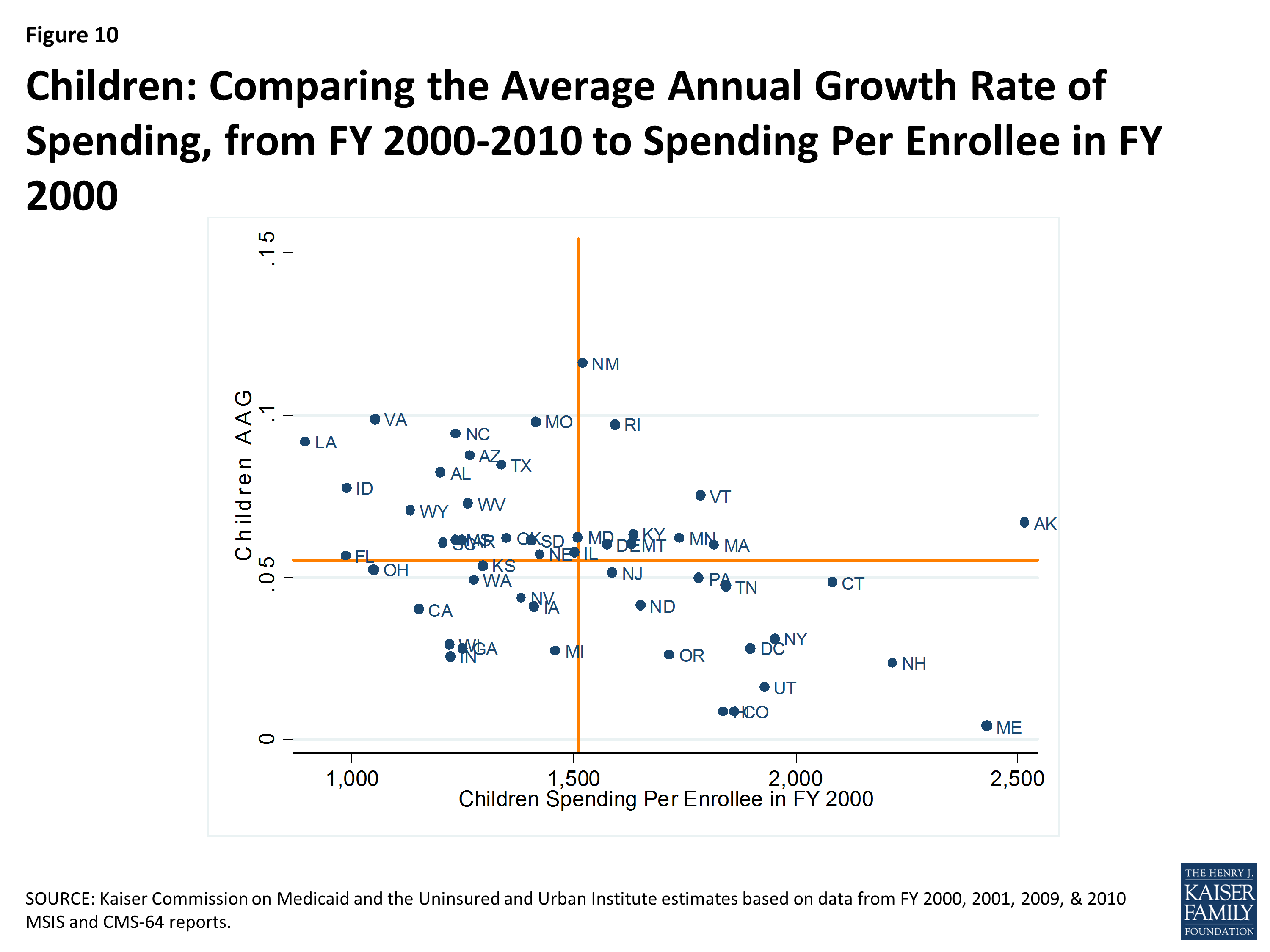
Figure 10: Children: Comparing the Average Annual Growth Rate of Spending, from FY 2000-2010 to Spending Per Enrollee in FY 2000
Proposals that limit federal Medicaid financing have also been tied to national growth targets such as GDP plus a percentage or CPI plus population growth; however, as we can see from this analysis spending growth varies significantly across states and eligibility groups, which would not be captured with nationally set growth limits. Given that this analysis shows that spending per enrollee in the base year is correlated with the growth rate, applying a national growth rate would result in a widening over time in federal financing to states that had low base-year spending per enrollee and states that had high base-year spending per enrollee.
Conclusion
This analysis shows that there is considerable variation in Medicaid per enrollee spending across states, across groups of enrollees and even within groups of enrollees within a state. The analysis also shows wide variation in average annual growth rates for per enrollee spending across states. This variation is multi-faceted and complex. Variation in Medicaid spending and growth patterns reflects the inherent flexibility built into the program for states to make policy choices to administer their programs within broad federal rules. Beyond policy choices, other factors such as a state’s ability to raise revenue, the need for public services, the health care markets in which Medicaid operates as well as the policy process all lead to variation in Medicaid programs and spending. Understanding the complexity of this variation is critical to understanding Medicaid and also to understanding that federal policy changes, particularly those that would alter the underlying financing structure of the program, inevitably would have dramatically different effects on different states.
Endnotes
See L. Snyder, R. Rudowitz, R. Garfield, and T. Gordon, Why Does Medicaid Spending Vary Across States: A Chart Book of Factors Driving State Spending, Kaiser Commission on Medicaid and the Uninsured, November 2012. http://www.kff.org/medicaid/report/why-does-medicaid-spending-vary-across-states/. See also G. Cuckler and A. Sisko, Modeling Per Capita State Health Expenditures, Medicare & Medicaid Research Review, 2013, Volume 3(4). http://www.cms.gov/mmrr/Articles/A2013/MMRR2013_003_04_a03.html.
When examining the per aged enrollee growth rate, we excluded prescription drugs spending. Beginning in FY 2006, Medicare began covering prescription drug spending through Part D. Consequently, spending per enrollee dually eligible for Medicare and Medicaid dropped between FY 2005 and 2006. Although this change in policy is important when considering what past spending in Medicaid can tell us about future spending, when looking at aged per enrollee spending over the FY 2000-2010 period, we decided to focus on the variation by state, rather than incorporating the effect of change in national policy.
Per capita growth was slower during the 2007-2009 recession and the following years of recovery than during the early 2000s. The slow growth in the later 2000s is likely attributed the increased pressure on states to balance their budgets, as well as a slowly improving economy.
The correlation coefficient shows the strength and direction of linear correlation between two variables. It ranges from -1 to 1. A negative correlation coefficient indicates an inverse linear relation between the two variables, as seen here. The closer the absolute value of the correlation coefficient is to 1, the closer the two variables are to a perfect linear relationship.